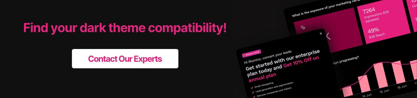
The call of the dark side is hard to resist. Not to mention, its rise in popularity has made reconsidering our UI design choices a necessity.
We always consider if a video thumbnail or social media post is dark theme friendly. What if our audience prefers dark mode UI for social media like Instagram or viewing media like Apple TV or other platforms? If the visual is not dark theme friendly, we might lose that audience based on that one incompatible design decision.
Most brands and colors are made per traditional UI (light theme UI), but that does not make them automatically compatible with the other side. As an entrepreneur or designer, you should ask whether the brand identity is consistent with light and dark themes? The change might do more harm than good if not actively worked upon.
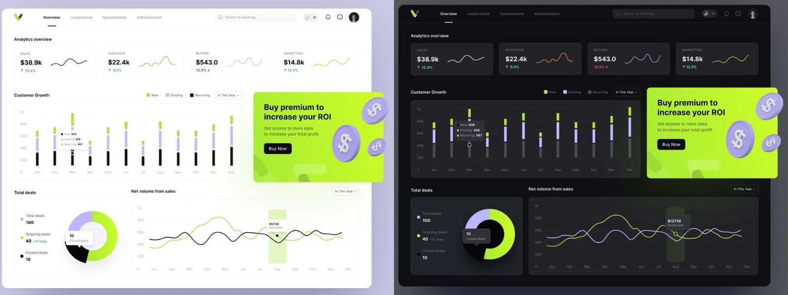
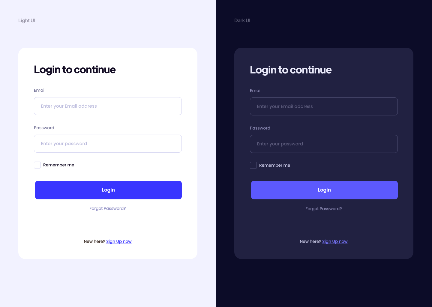
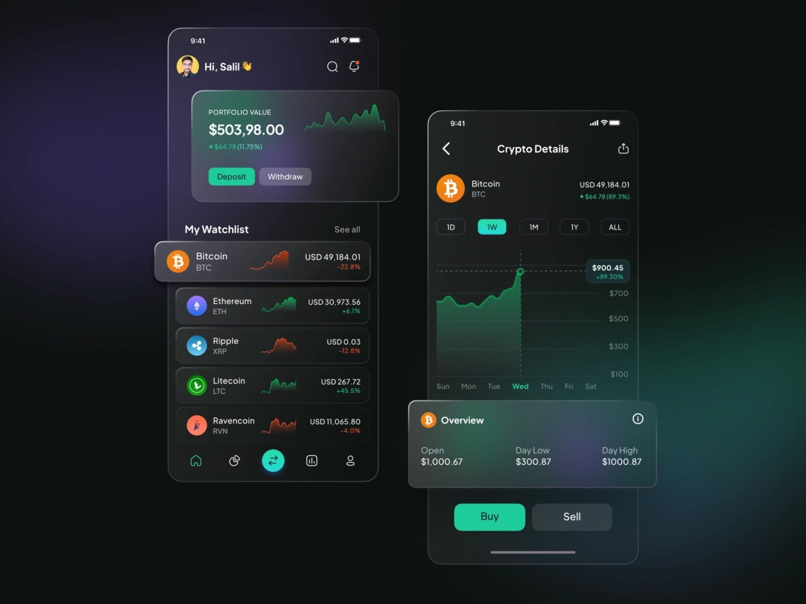
So, what is a good transition example? Here is one
We all want our light to dark mode UI transitions this flawless and smooth. And you can follow a few quick things to achieve just that.
Compatibility
Compatibility isn’t just white on black or black on white; the space surrounding the text, the color palette used in the design, and the brand color harmony are all included.
Tip 1: Readability
Black on white is known to be the optimal reading condition. If the website or application is text-heavy, stick to light themes through and through. Dark themes can make it look cluttered and congested.
For dark themes, we prefer lesser text and heavy visual formats. If there is a vibrant visual page or bright stat diagrams and charts with fewer numbers and texts, dark UI modes are most welcome.
Tip 2: Color harmony
Not all brand logos, mood boards, and color palettes are compatible with dark mode UX. For some brands like banking and e-learning pages, their audience mindset does not fit well with dark modes.
Brands that want a dark mode UX for their application should incorporate dark theme-friendly mood boards in line with their audiences. Avoiding saturated colors against a dark background is one of our know-hows.
Dark themes are also aesthetically attractive for luxury, dramatic, or mystery effects, making them more suitable, for example, in accessory, fitness, or gaming spaces.
User Experience
Take your game to the next level with adaptability. Dark theme UI designs are increasingly associated with user experience. They reduce eye strain, allowing longer screen time. Take Apple TV and Netflix binge experience. Look for ways to enrich the experience.
Tip 3: No Color Inversion
The dark theme is not the color inversion of light mode UI. Avoid using absolute black (#000000) backgrounds. Use variations that suit your color palette best.
Everyone has their mood boards for this. Where Google’s Material Design says #121212, Apple’s Design kit uses #1C1C1E
Tip 4: Loss of Visibility
If a page has long since existed for light theme mode, viewing in dark mode UX can wipe away much of the text that does not change color to contrast the dark background. It can considerably dampen the user experience. Make sure to fix these glitches in dark mode UX.
Dark Theme Friendly
Having discussed where to use dark UI themes and what does not work for them, there only remains to say what options are dark mode UI friendly.
Tip 5: Provide Color Contrast
Color contrast is a tricky business, especially in dark mode UI. Black does not have a wide range of contracts, but thankfully, black is not recommended either.
Dark themes mostly use varied shades of gray, which give a more comprehensive range of color compatibility and allow some content for drop shadows. For contrast, you can use from a range of pure white (#FFFFFF) to multiple degrees of opacity.
Tip 6: Use Negative Space
Saying ‘less is more’ finds an apt application in dark theme UI Designs. Making the most of this UI demands leveraging negative space with each page section. Take as much space as possible for each little section.
The more the negative space in each element of the dark UI mode, the more user-friendly it will be. It allows the eyes to rest more between changing sections or details.
Conclusion
If you are looking for some quick transition tips to align your existing light mode UI into a dark-themed UI for compatibility or user experience, the above tips are an excellent place to start. You will also learn visual pairings and customized settings that work best for your audience to elucidate your website.
Just like our dark mode UI tips, our UX tips will change the way you design!
If you want to establish a dark theme UI design for your app or brand, begin with a suitable background color and a compatible palette to compliment and contrast your background appropriately.
FAQ
Ques 1: When did the dark mode UI gain popularity?
Ans1: It gained popularity in 2019 at the Google I/O conference. One of the major announcements was the introduction of the Dark Theme on Android Q.
Ques 2: When dark UIs don’t work well?
Ans2: If you have a text-heavy website, or using a variety of content types (text, images, video, data tables, dropdowns, fields, etc.) then dark-themed UIs are a bad choice.
Ques 3: When Dark Mode UIs Work Well?
Ans 3:
- It works well on a simple page.
- When there is little text on the website.
- Dramatic look.
- Draw attention to colorful elements.
Ques 4: How much does it cost to make a dark mode of a website?
Ans 4: It totally depends on the development company you have contracted with. Changing color and themes with a bunch of codes might not be a difficult task if you hire a professional designer.
Ques 5:Design challenge in dark mode UI design?
Ans 5. Color works differently in dark and light modes. For example, if you have saturated colors, it works better in dark mode.