To focus on the end user’s experience, it is important to build products that are highly usable. At illuminz, we create experiences that are not only delightful but also provide additional value to your customers and your business. This is why UX design plays an important role in our design and development process.
To create a unique value proposition, our product designers have listed some of the most crucial tips that’ll make your designs more meaningful. You can share it with your design and marketing team or learn it yourself.
Here we go..
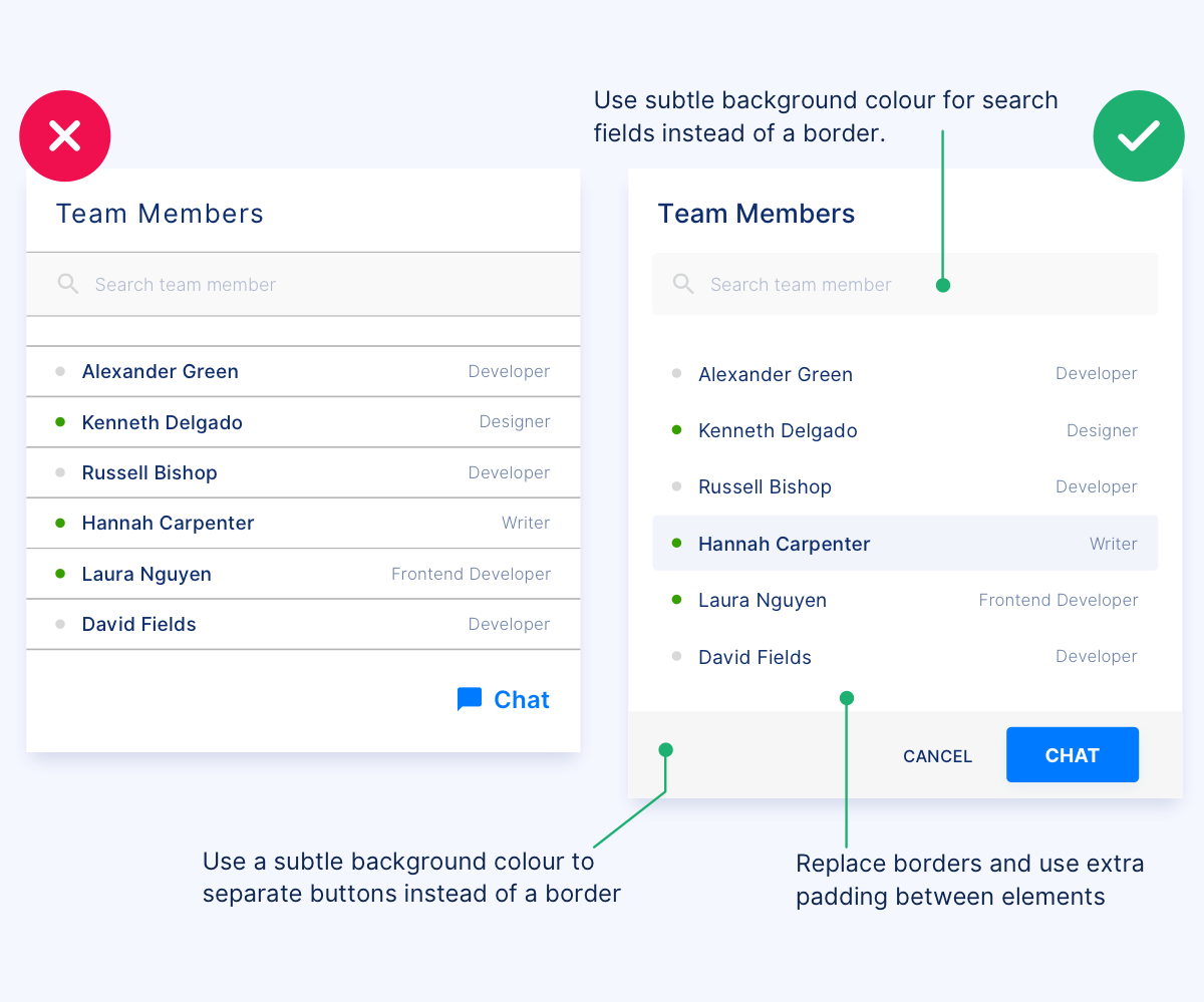
#1 Control too many borders
Controlling too many borders in design crafts a beautiful and functional interface. You can easily manage the focus of visitor’s attention with a subtle contrast between elements.
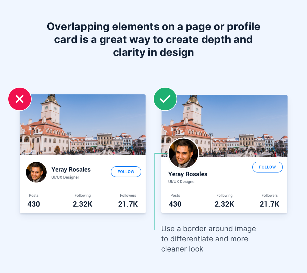
#2 Adding overlapping elements in the design
While designing profile page cards, make sure to add overlapping elements especially on the profile picture to add depth to design and give it a clearer meaning.
#3 Accessible contrast ratio with colored text
Since users are in a habit to scan things quickly, contrast plays an important role in making text visible and easily readable.
Elevate Your UX Today!
Unlock the power of exceptional user experiences with illuminz. Elevate your brand, captivate your audience, and boost your business. Contact us for transformative UX design services.
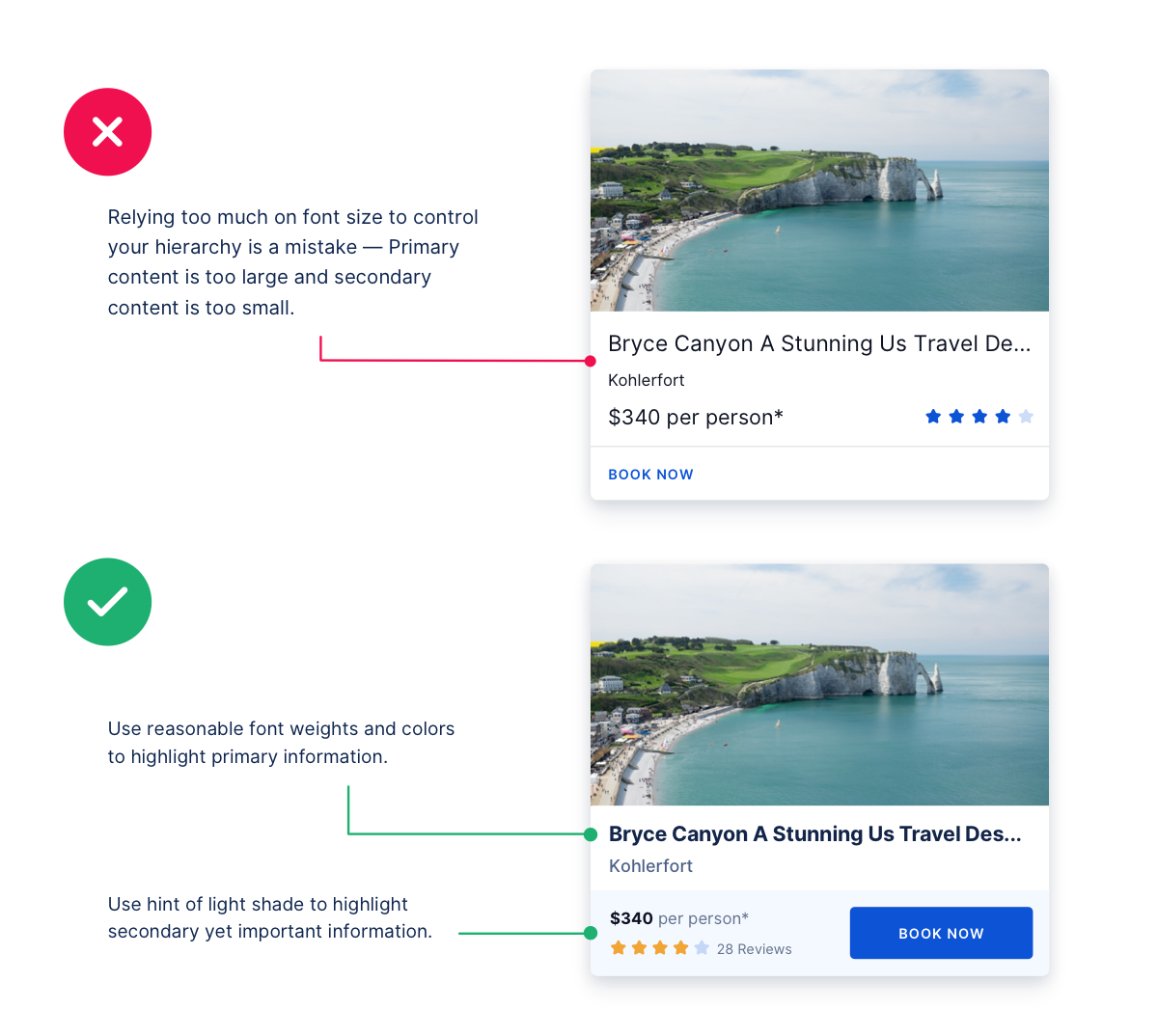
#4 Use font weights instead of only font sizes to do the job
Instead of relying too much on typography variations to font size, pay attention to the font weight and colors.
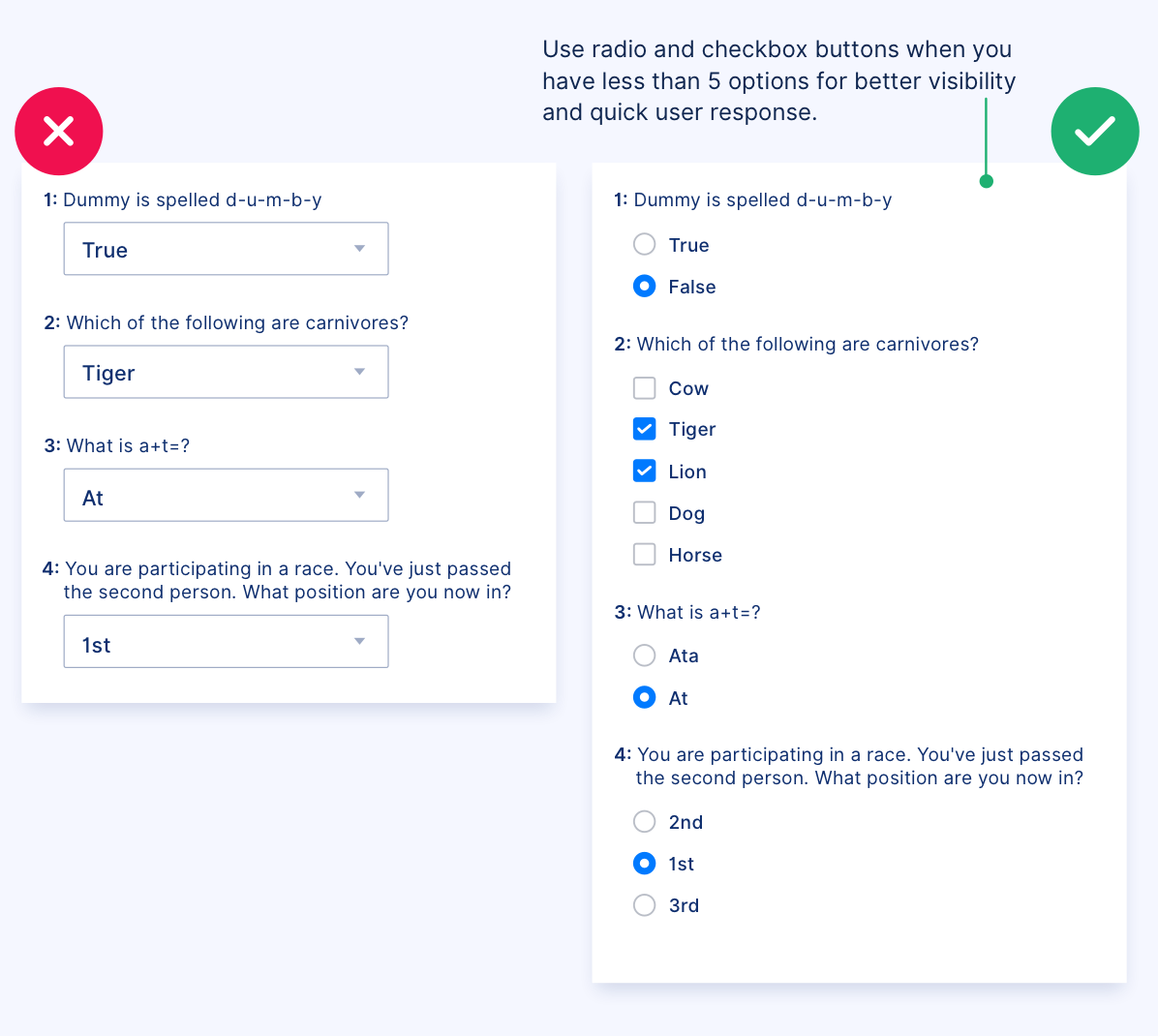
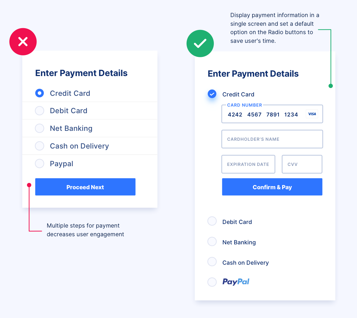
#5 Use checkboxes instead of the drop-down list
When designing forms, use checkboxes and radio buttons. Displaying all options help users make fast decisions while making a choice.
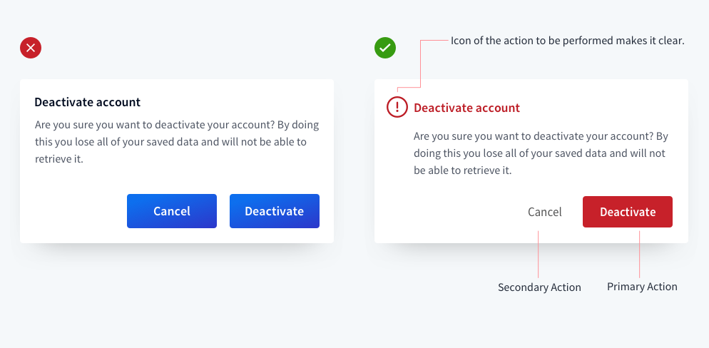
#6 Using icons to display important messages
Rather than using simple text, make use of icons to display important messages. Also, pay special attention to primary and secondary actions.
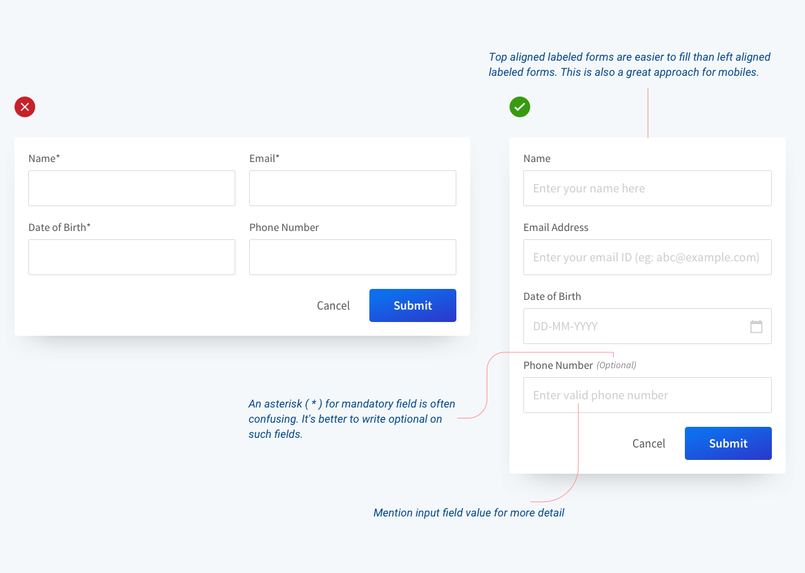
#7 Use single column in forms
When designing forms, make sure to work in a single column. Multiple columns disrupt the user’s vertical momentum.
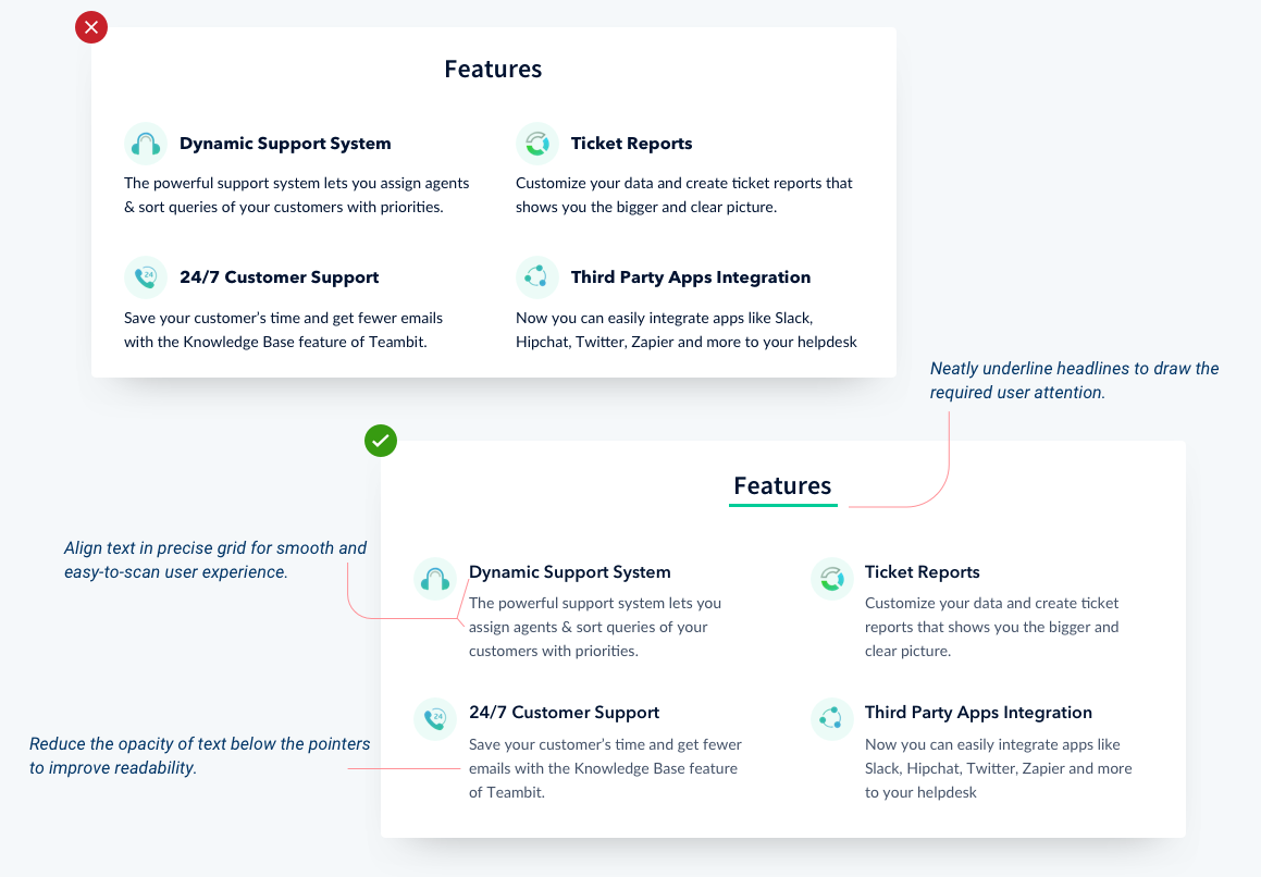
#8 Use grid-based text alignment
When designing the feature section, help users scan the page quickly with neat and grid-based text alignment.
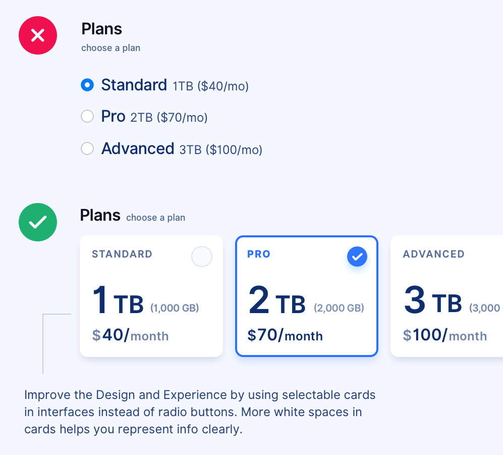
#9 Get creative with radio buttons
While designing radio buttons, use selectable cards with more white space to help users make informed decisions. Works best when designing pricing plans.
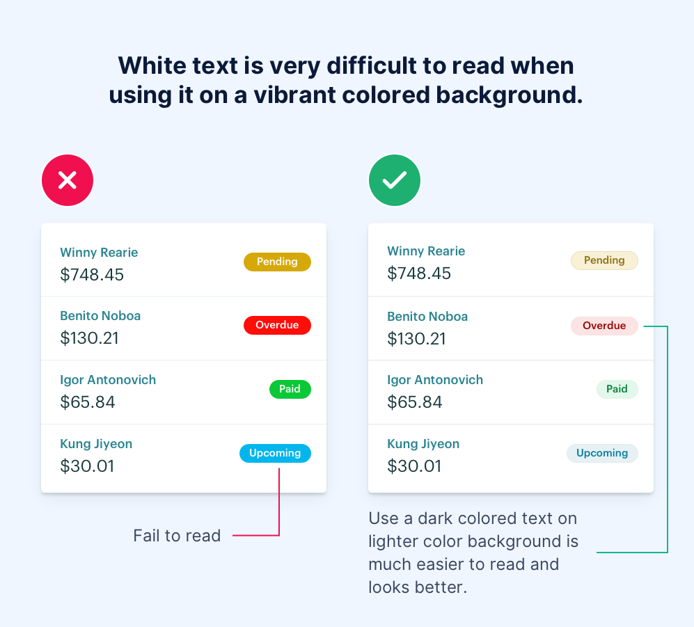
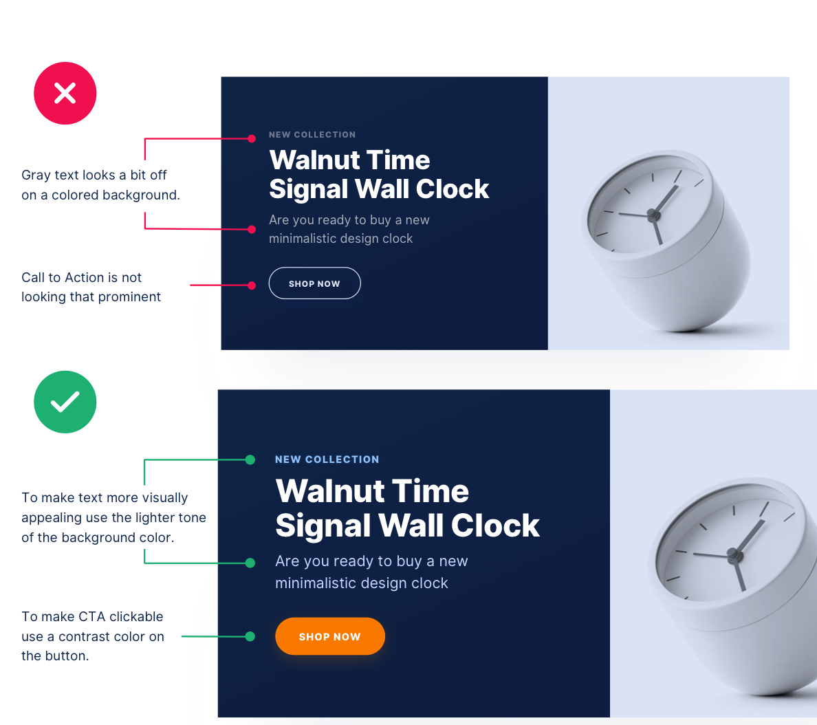
#10 Work smartly with colored backgrounds
Deciding the text color on colored backgrounds can be tricky. Here’s a simple yet highly valuable tip to help you make better choices between the hues and their lightness.
#11 Display payment info on a single screen
When designing invoices, make sure you display information clearly with the right action buttons. Also, use subtle colors that don’t draw too much attention.
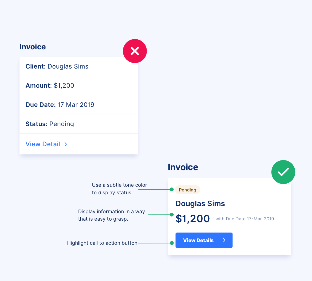
#12 Display only important info in invoice cards
Avoid multiple steps while designing invoices and display information that is important to the user. Not only does it look clean but it also saves time and improves user experience.
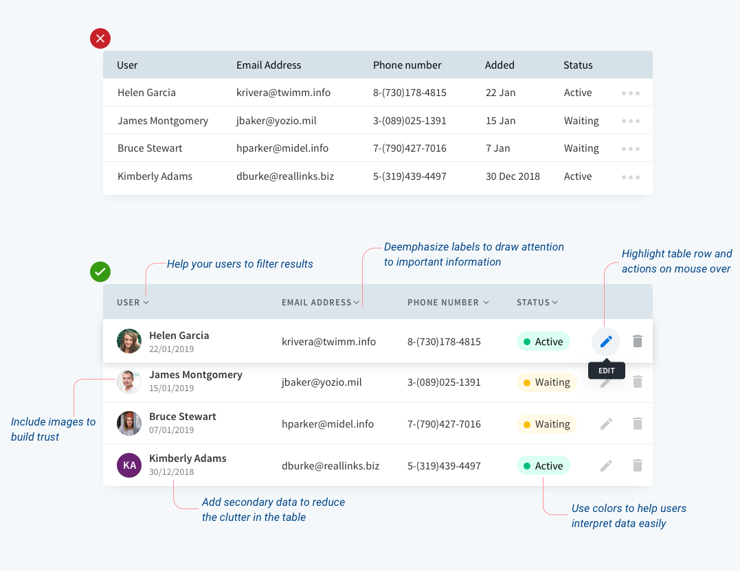
#13 Use elements to display info in tables
To design tables, it is important to showcase data that isn’t congested and has space to breathe. This helps users scan information easily in-a-go.