

If you've ever worked on a design project, you probably have yet to receive feedback from clients about using too much empty space in your designs. "Fill it up!" they say. But what if we told you that space, also known as white space, plays a crucial role in design and can significantly impact how your creations are perceived? White space can encompass as much as 50% of a web design on a page, offering ample room for content to breathe and allowing it to thrive.
In this article, we'll delve into the concept of white space in design, exploring why it's essential and how to use it effectively. We'll also showcase some remarkable examples of white space in web design and discuss why they're so effective.

What is White Space in Design?
White space, in terms of design, is often referred to as negative space. Despite its name, it doesn't have to be white; it can take on any color as long as it lacks visual elements such as text, shapes, or images. Think of it as the empty canvas that allows other design elements to shine.
White space is ubiquitous in design, whether it's on a website, within the pages of a book, or on the labels of food packaging. Most of the time, we don't consciously notice it, and that's precisely the point. White space, unlike other design elements, is invisible.
Its primary purpose is to separate and emphasize other design elements, guiding the viewer's attention to what matters most. However, in some instances, white space can be so dominant that it becomes a deliberate design choice, conveying symbolic meaning.
Transform Your Design
Unlock the Potential! Elevate Your Website Designs Today.
Understanding Micro and Macro White Space
White space isn't just a blank canvas waiting to be filled—it's a powerful tool that shapes how we perceive and interact with content. White space comes in two distinct types: micro and macro. Understanding the delicate dance between these two types of space can make or break a design. So, let's dive into the intriguing world of micro and macro white space and discover how they influence our design choices and user experiences.
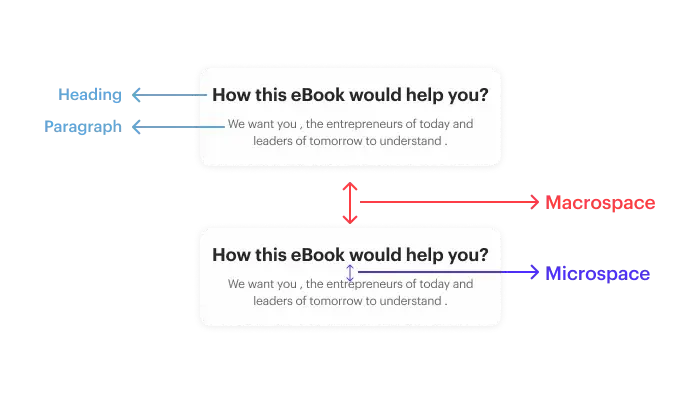
Micro White Space: The Fine Details
Micro white space is the unsung hero of design. The tiny spaces nestled between lines of text, the breathing room around images, and the unassuming gaps separate menu links. While it might appear subtle, micro white space wields a considerable influence over the legibility and usability of a design.
Picture this: You're reading a captivating article with comfortably spaced text. You can effortlessly glide your eyes from one line to the next, absorbing the content with ease. That's the magic of micro-white space. When it's done right, it enhances reading speed and comprehension. On the other hand, if the text is crammed too tightly, like sardines in a can, readers struggle to navigate, their awareness dwindles, and frustration mounts.
Macro White Space: The Grand Architect
Macro white space is the maestro of the design orchestra. The sweeping, open areas encompass major layout elements and the generous margins frame your content. Unlike micro white space, macro white space commands attention and sets the stage for the entire design.
The perfect example is Google's homepage—a pristine example of macro white space. As you type your query into the search bar, you're greeted with an expanse of white. It's beautifully simple, almost meditative. Why? Because macro white space is the container of the design, the "big picture" that invites calmness and focus. There's no clutter, no visual noise. Your eyes and mind can breathe, allowing you to concentrate on the task at hand: searching.
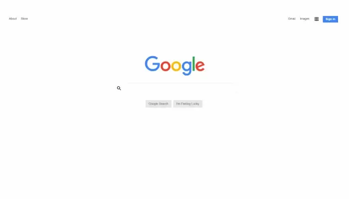
Google's minimalist approach to design, punctuated by abundant macro white space, was no accident. In the early days of the internet, when dial-up connections were the norm, users encountered pages laden with white space, and they had to wait for content to load. This surplus of emptiness puzzled them. As a response, Google added a discreet copyright notice at the bottom of the page—a subtle signal that the page had fully loaded. This ingenious use of macro white space not only improved user experience but also shaped Google's iconic design.
The Symbiotic Relationship
Micro and macro white spaces are not rivals; they are partners in the dance of design. They work together to create harmony and balance. Micro white space ensures that content remains legible and digestible, while macro white space sets the overall tone and mood of the design.
Imagine reading a beautifully formatted book. The generous margins (macro white space) provide an elegant frame for the text, and the well-spaced lines (micro white space) make reading a joy. This combination of macro and micro white space exemplifies the delicate balance that designers strive for.
Beyond Aesthetics: The Hidden Benefits of White Space
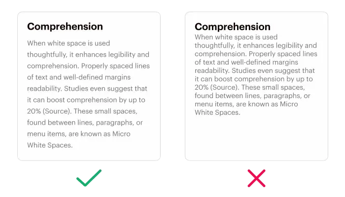
- Improved Comprehension: When white space is used thoughtfully, it enhances legibility and comprehension. Properly spaced lines of text and well-defined margins increase readability. Studies even suggest that it can boost comprehension by up to 20%. These small spaces, found between lines, paragraphs, or menu items, are known as Micro White Spaces.
- Focus and Attention: Macro White Spaces, the large spaces between layouts and design elements, guide users through a page, directing their attention to key areas. For instance, the simplicity of Apple's website design immediately focuses your attention on their products.
- Increased Interaction Rate: In today's fast-paced digital world, attention spans are shorter than ever. Did you know that the average attention span of an internet user spans a mere 6 seconds? Effective use of white space ensures your message is quickly communicated, increasing the likelihood of user interaction, particularly with call-to-action buttons.
- Logical Grouping: White space in design plays a pivotal role in helping users organize visual information. The Law of Proximity, established by Gestalt psychologists, states that objects near each other appear similar. White space between elements helps users make logical sense of the content presented to them.
- Branding and Design Tone: The proportions of micro and macro white spaces define a webpage's character. News websites often favor micro white spaces, while heavy use of macro white space imparts a sense of sophistication and luxury. Consider Apple or Microsoft's websites, for example.
- Creating Breathing Space for Users: White space isn't just about aesthetics; it's about creating a comfortable experience. When content is surrounded by white space, it provides users with breathing room, preventing visual overload and making the information more digestible.
- Prioritize Clarity: Ensure that white space enhances readability and doesn't clutter your design. Research indicates that websites featuring generous white space experience a substantial boost in visual attention, ranging from 35% to 45%, in comparison to sites with cluttered layouts or insufficient white space. So, test your layout with real users to gauge comprehension.
- Guide the Eye: Use macro white space to guide users' attention to important elements and messages. Let it tell a story and lead users through your content.
- Balance Micro and Macro: Find the right balance between micro and macro white spaces to convey the desired tone and character of your design.
- Experiment and Iterate: Don't be afraid to experiment with white space. Iterate on your designs, gather feedback, and then you can refine the approach to find exactly what works best for the audience.
Mastering the Art of White Space
To use white space effectively in your designs, consider these tips:
4 Inspiring Examples of White Space in Web Design
White space in web design isn't just about empty gaps; it's a powerful design element that can transform a website's look and feel.
Let's explore four stunning examples of web designs that effectively utilize white space to create visually engaging and user-friendly experiences.
1- Perform.fm by Cuberto
Cuberto's design for Perform.fm embraces minimalism with generous white space. Sparse text, coupled with ample white space, directs the user's attention to large images and bold headlines. Despite much of the white space being actually white, the design feels clean, fresh, and modern. This approach aligns perfectly with the aesthetic of a quality app, showcasing how white space can enhance user engagement.

2- Canvas Agency
Canvas Agency's website masterfully demonstrates macro and micro white space in action. White space is used to an extreme degree to create an artistic effect. Surprisingly, the uneven padding and margin in the image grid on the homepage maintain a sense of balance. This example showcases the creative potential of white space in web design.

3- Cowboy
The new electric bike brand Cowboy draws inspiration from Apple's minimalist web design. Their ultra-modern website showcases full-width product images against a monochromatic backdrop with minimal text. This strategic use of white space imparts a sleek, high-tech aesthetic that aligns perfectly with the brand's image. This trend of minimalism for premium tech products, pioneered by Apple, has spread to brands like Tesla, MIRROR, and Peloton.

4- The Sea We Breathe by Blue Marine Foundation
Blue Marine Foundation's interactive website, "The Sea We Breathe," offers a unique perspective on white space in graphic design. Instead of traditional empty space, the site features full-screen imagery on every page. However, this approach is manageable for the user. The design intentionally keeps text minimal and places the front and center of the main headlines during scrolling. The result is a delightful and fluid user experience that doesn't compromise on content or aesthetics.

Conclusion
So, the next time you receive feedback about "too much space" in your designs, remember that white space isn't wasted; it's the canvas on which your masterpiece is painted. Embrace it, harness its power, and use it thoughtfully to create designs that captivate and provide clarity and ease of use. By mastering the art of white space, you can elevate your design game and leave a lasting impact on your audience.
Frequently Asked Questions on White Space in Design
Ques 1: Does the color of white space matter, or can it be any color?
Ans 1: White space doesn't have to be literally white; it's a design principle that refers to the empty or unused space within a layout. This space can take on various colors to complement the overall design scheme. The key is to ensure that the choice of color for the white space harmonizes with the design's aesthetics and objectives.
Ques 2: Can too much white space be a problem in design, and if so, how can it be addressed?
Ans: Excessive white space can potentially lead to issues like reduced content visibility or an unbalanced design. To address this, it's essential to strike a balance. You can consider adjusting margins, padding, font sizes, or introducing additional content or visual elements to optimize the layout. The goal is to maintain an aesthetically pleasing and user-friendly design without overwhelming the viewer with too much empty space.