“Design is not just what it looks like and feels like, Design is how it works.” -Steve Jobs
It is a cliche question and yet still stands true - Can you imagine your life without the internet?
Your everyday tasks - from ordering food online, booking your rides, using banking facilities and even performing your job are done on the internet.
So is it safe to say that if your experience with the internet and its website wouldn’t be as smooth as we expect, our preferences would change?
So how can a website owner make his website design inclusive and accessible?
How to ensure that your website offers the most seamless and effortless experience to its users?
What Is Meant By Inclusive Web Design?
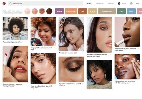
Ever been a pinterest user? It's one of the most diversified and inclusive platforms. It offers voice to all communities and has inculcated various features to amplify their voice.
Inclusive design and accessible design go hand-in-hand just like - UX and UI.
In the simplest language, inclusive design ensures that no group is overlooked in terms of their needs and concerns and accessible design is a tactic for achieving this task.
In the present era, where people are more aware of diversity, equality and inclusion, companies need to ensure that their marketing campaigns are not limited to just one group of people.
For this, they might need to expand their messaging, design and media to a larger and diverse audience. And this includes people with disabilities, different backgrounds, different age groups, genders, social economic classes and also religion.

If you are confused about how to start, then continue reading the article for better insights.
Ways To Make Your Website More Inclusive
Restructure your content
Content is the most important part of your website. It not only conveys your brand values and morals but also helps in engaging your audiences better.
Your content should be such that it is easier for the users with visual, language and other disabilities to read and understand.
Here is how you can do that-
- Make sure to bifurcate your content with headings and subheadings and that you break your longer blocks into shorter sections.
- Use the appropriate text size and line spacing.
- Your background and content should have an appropriate color contrast.
Descriptive alternative text
Writing helpful alt text for your images is one of the essential yet the most overlooked areas. These alt texts help the screen readers to better describe the images to any user.
While writing the alt text, try describing what is happening within the image and how it is related to the content. This makes it comfortable for users to depend on alt text for interpretation of an image.
Avoid text images
Back then, owing to the limited coding standards and browser capabilities, designers and developers created images that included texts to add creativity to the website.
But web design has come a long way and designers no longer resort to such designs.
It’s hard for screen readers to accurately read the text embedded into an image and also images tend to resize based on desktop, mobile or a tablet. Meaning, The size of the image reduces as the window gets smaller.
Therefore avoid using images with such designs.
Use of focus states
Ever come across a page and notice a blue box that occasionally appears around buttons or links?
These outlines or boxes are known as focus states and are an outstanding feature to help increase accessibility for people using keywords to navigate through the page.

Focus states are used to highlight that element which is currently selected and helps the user to know exactly where they are on the page.
Some websites do not find them visually appealing and actually hide them, instead use them as a design challenge to enhance your brand.
Use of HTML markup
While structuring the content on the front end, make sure to use the proper HTML markup for the same on the backend of your website.
Using heading tags (H1, H2…. etc) or button tag to denote buttons on a page and choosing the correct attributes is very important.
Creating structure using those tags helps the visually impaired to rely on them for easily browsing the web.
Descriptive form fields
For a lot of us, our business depends on lots of form fillings and therefore it is crucial for everyone to easily fill these out.
One mistake that usually everyone makes is by using the placeholder text (light gray text that goes away once you start typing in the field).
This text can be tough to read for the visually impaireds.
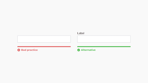
In such cases use of label tags saves the day!
Along with this, make sure that people understand what they are supposed to write in the form. You can assure this by adding a small helper text or a tool tip.
Correct choice of color contrast
This feature is often overlooked!
For people with vision impairment, text that doesn’t have contrast with the background color can be a nightmare to read.
According to W3C, “ The ideal contrast ratio between text and its background should be at least 4.5:1”.
There are various online tools available that help you to test the color contrast not only for your main content but also for elements like buttons and form fields.
One such example of the online tool is WebAim Color Contrast Checker.
Clear and concise text
Your content should be Plain and Simple!
The simpler your content is, the more it will catch up to a larger audience. Not only for the people with disabilities but for everyone in general, your content should be easy to understand.
While writing your content, consider the following guidelines:
- Avoid usage of acronyms or jargons.
- Use Bullet lists whenever possible.
- Maximum usage of images or videos should be done to clarify complex ideas.
- If you use acronyms, make sure to mention the expanded version on the first use.
In the end, it all comes down to empathy! As marketers and designers, we have the responsibility to make sure that our content and work is for everyone to use and access.
It not only creates a better experience for everyone, but also projects our brand's value and it’s care for the needs of a bigger audience.