

Did you know that 60% of the worldwide web traffic now comes from mobile devices? With this dramatic shift in user behavior, the debate between adaptive vs responsive design has become more crucial than ever for ensuring an optimal browsing experience.
Let's delve into the world of web development and explore why responsive design might just be the key to meeting the diverse needs of today's mobile-first users.
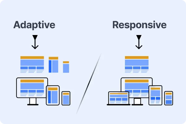
Understanding Responsive Design
Responsive design is the fundamental concept in creating flexible, user-centric websites, ensuring seamless interaction regardless of the device(computer, tablet, or phone).
Pioneer of Responsive Design
Ethan Marcotte introduced responsive design in the early 2010s, marking a transformative period in web development. This approach emerged as a solution to the growing diversity of device sizes and resolutions, advocating for websites that dynamically adjust to the user's environment.
Key Element of Responsive Design
- Fluid Grids: At the heart of responsive design are fluid grids that utilize relative units (e.g., percentages) instead of fixed pixels. This allows page elements to adjust proportionally, offering a consistent experience across different screen sizes.
- Flexible Images and Media: Implementing max-width: 100% for images and media ensures they scale within their containers without losing aspect ratio or overflowing, maintaining visual integrity across devices.
- Media Queries: CSS media queries enable the application of different style rules based on the device's viewport size, allowing for precise adjustments to enhance usability on various screens.
- Viewport Meta Tag: This HTML tag controls the viewport's dimensions and scaling, ensuring websites render consistently across different platforms.
- Mobile-First Approach: Prioritizing mobile design reflects the contemporary trend towards mobile usage, focusing on optimizing the user experience for smaller screens before scaling up to desktop views.
- Content Flexibility: Ensuring content remains readable and accessible on all screen sizes is crucial, adapting layout and text to maintain usability and engagement.
- Cross-Device Testing: Continuous testing across a range of devices is essential to identify and rectify any issues, guaranteeing a uniform experience for all users.
By incorporating these key elements, responsive design enables websites to deliver an optimal user experience across a wide range of devices, ensuring accessibility and usability for all users.
Example of Responsive Design Code
Understanding Adaptive Design
Adaptive design is a method for making websites that change to fit whatever device people are using to go online.
Pioneer of Adaptive Design
It was introduced by Aaron Gustafson in 2011. Unlike responsive design, which fluidly adjusts the layout based on viewport size, adaptive design involves creating 6 fixed layout sizes 320px (Mobile Portrait), 480px (Mobile Landscape), 768px (Tablet), 1024px (Small Desktop), 1280px (Medium Desktop), 1440px (Large Desktop).
Key Elements of Adaptive Design
- Fixed Layouts: Unlike responsive design's fluid grids, adaptive design utilizes fixed layout configurations optimized for specific device categories or breakpoints.
- Device Detection: Adaptive design relies on server-side or client-side techniques to detect the user's device and deliver the appropriate layout configuration.
- Predefined Breakpoints: Designers define specific breakpoints corresponding to common device categories (e.g., smartphones, tablets, desktops) and create distinct layouts for each breakpoint.
- Tailored User Experience: Adaptive design allows for a more tailored user experience by optimizing layout and content presentation for each device category, ensuring optimal usability and performance.
- Performance Optimization: By delivering device-specific layouts, adaptive design can optimize performance by reducing unnecessary code and resources for devices with different capabilities.
- Progressive Enhancement: Similar to responsive design, adaptive design adopted the principle of progressive enhancement, ensuring that basic functionality and content are accessible across all devices while enhancing the experience for more capable devices.
Example of Adaptive Design Code
Comparison between Responsive and Adaptive Design
| Feature | Responsive Design | Adaptive Design | |||||||||
|---|---|---|---|---|---|---|---|---|---|---|---|
| Layout Adjustment | Fluidly adjusts layout based on viewport size | Delivers predetermined layouts for specific devices | |||||||||
| Grid System | Utilizes fluid grids | Often uses fixed layout configurations | |||||||||
| Media Queries | Uses CSS media queries for styling adjustments | May use device detection for layout adaptation | |||||||||
| Flexibility | Offers more flexibility across a wide range of devices | Provides tailored experiences for specific device categories | |||||||||
| Development Approach | Single design that adapts to all devices | Multiple designs optimized for different devices | |||||||||
| Testing | Requires testing across various screen sizes | Requires testing for specific breakpoints |
Flexbox: The Key CSS Model for Responsive and Adaptive Web Design
The Flexible Box Layout, commonly referred to as Flexbox, is a CSS3 web layout model designed for arranging elements in a container to improve alignment, direction, order, and spacing of items, regardless of their size. It provides a more efficient way to lay out, align, and distribute space among items in a container, even when their size is unknown or dynamic.
In the context of web design approaches:
- Responsive Design: Flexbox is highly suitable for responsive design because it enables the creation of flexible and fluid layouts that adjust to the screen size.
Technical features of Flexbox, such as flex-wrap, flex-direction, and justify-content, allow developers to create layouts that adapt to various device widths seamlessly. This adaptability ensures that web pages can provide optimal viewing experiences across a wide range of devices, from mobile phones to desktop monitors. - Adaptive Design: In adaptive design, which involves designing multiple fixed layouts for different screen sizes, Flexbox can still play a crucial role. It can be used within each fixed layout to manage the layout's internal components flexibly and efficiently.
For example, using align-items and flex-grow properties, developers can ensure that elements within a container are properly aligned and that they utilize the available space effectively, even if the overall container size is fixed for a specific screen size.
Flexbox's properties provide a powerful and flexible set of tools for web developers, making it easier to design responsive and adaptive layouts without resorting to hacky solutions or extensive media query sets. Its ability to control spacing and alignment of elements dynamically makes it a cornerstone technology for modern web design.
Choosing Between Adaptive and Responsive Design:
The choice between adaptive and responsive design depends on your project's specific needs, target audience, and resources. Responsive design is generally preferred for its fluidity and ability to accommodate an extensive range of devices with a single layout. It's particularly effective for providing a consistent user experience across devices and is easier to maintain in the long run.
Adaptive design, on the other hand, might be suitable for projects targeting specific devices or where custom experiences for different device types are crucial. It can offer performance benefits by loading only the necessary resources for each device, but it requires more upfront work to set up and maintain multiple layouts.
In conclusion, both responsive and adaptive designs have their place in web development. The choice between them should be guided by the project's goals, audience needs, and the desired level of customization and performance optimization.
Frequently Asked Questions on Adaptive vs. Responsive Web Design
Ques: Are there specific industries or types of websites that benefit more from adaptive or responsive design?
Ans: Yes, the choice between adaptive and responsive design often depends on the specific goals, audience, and content of a website, with certain industries and types of websites benefiting more from one approach over the other. Here's a look at how these preferences might align:
Responsive Design is generally best for:
- Blogs and editorial websites: Adapts easily to any screen size for text-heavy content.
- Small to medium e-commerce: Simplifies development with a one-size-fits-all approach.
- Educational and corporate websites: Ensures accessibility and ease of use across devices.
Adaptive Design is often preferred for:
- High-end e-commerce and retail: Offers tailored experiences that can improve sales.
- Banking and financial services: Addresses specific security and usability needs of mobile vs. desktop users.
- Entertainment and gaming: Delivers device-specific functionalities for an enhanced user experience.
- Travel and booking sites: Optimizes complex forms and searches for different devices.
The choice depends on the user base, performance needs, budget, and content complexity. Responsive design is more versatile and cost-effective, while adaptive design provides optimized, device-specific experiences.