

Introduction:
A website menu is like a roadmap that guides visitors to different sections of your website.
It is essential to make every page easily discoverable and accessible to users, as it drives conversions and improves search engine rankings.
However, managing web page structure can be complex, and overlooking essential elements can lead to costly mistakes.
This comprehensive guide will explore the dos and don'ts of crafting an intuitive and efficient navigation layout.
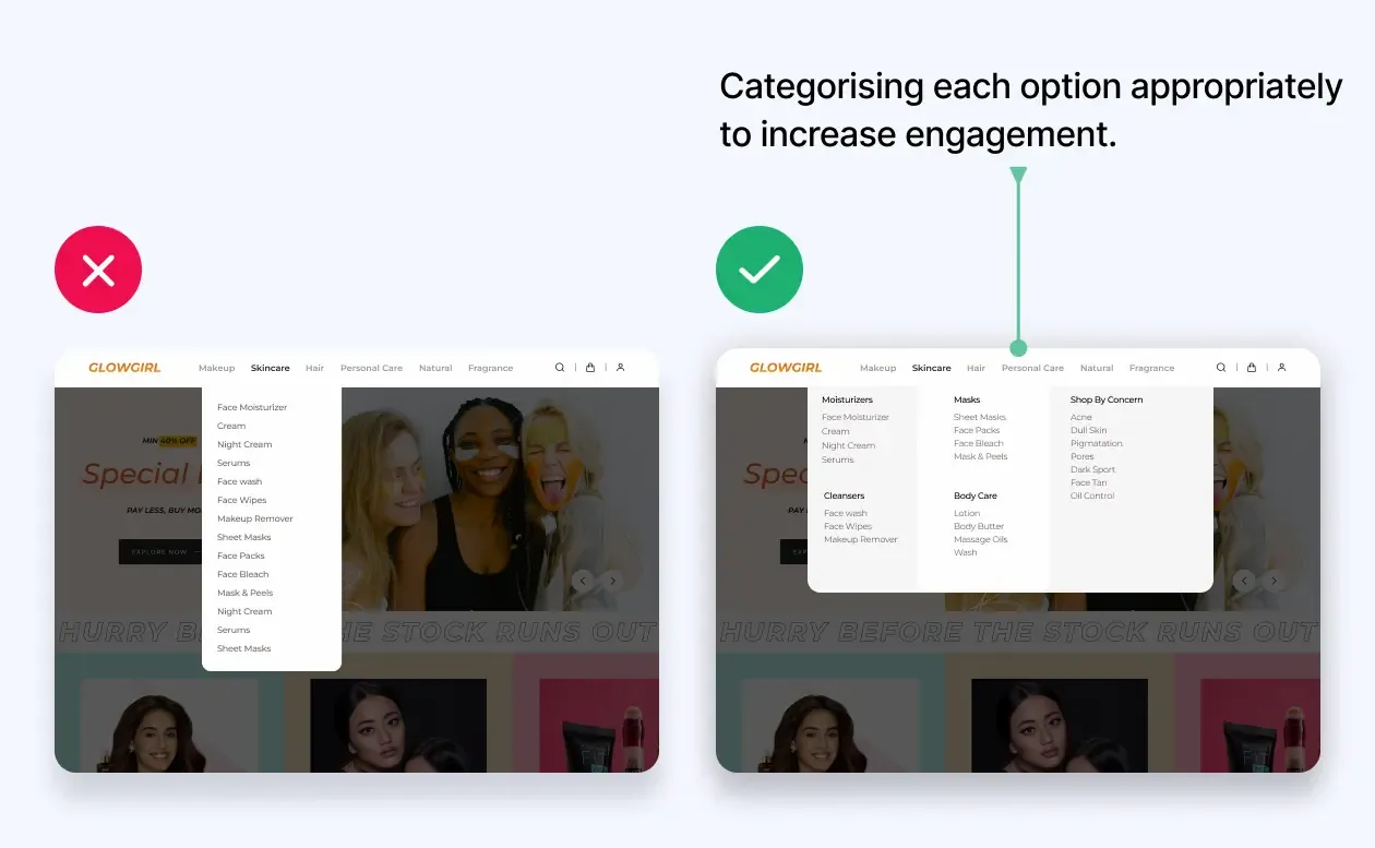
#1- To create a clean and straightforward main navigation menu:
A cluttered navigation menu can overwhelm visitors and divert their attention.
Maintain simplicity by limiting the number of menu items and grouping related pages together.
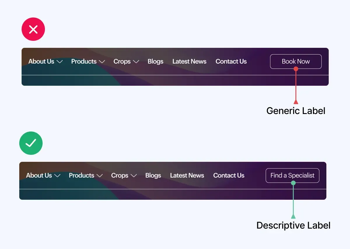
#2- Make labels descriptive and concise:
When creating labels, it is crucial to balance descriptiveness and conciseness.
Generic labels do not communicate your services or products satisfactorily to the customers.
Descriptive labels enable quick understanding, while concise labels prevent information overload.
Striving for this balance ensures that labels effectively serve their purpose.
#3- Optimising Navigation Placement for Improved User Experience and Conversions
To enhance user experience and boost conversions, it is essential to position your navigation in familiar places, such as horizontal navigation across the top or vertical navigation down the left side. This enables visitors to easily navigate your site, leading to a lower bounce rate and more pages viewed per visit.
#4- Don't use more than seven items in your navigation menu:
-Keep Menu Items To 7 Or Fewer And Boost Engagement
When designing a website, one of the most important decisions you’ll have to make is how to structure your navigation menu. While including every page and subpage on your site in your menu can be tempting, this can quickly become overwhelming for your visitors. That’s why experts recommend limiting your menu to no more than seven items.
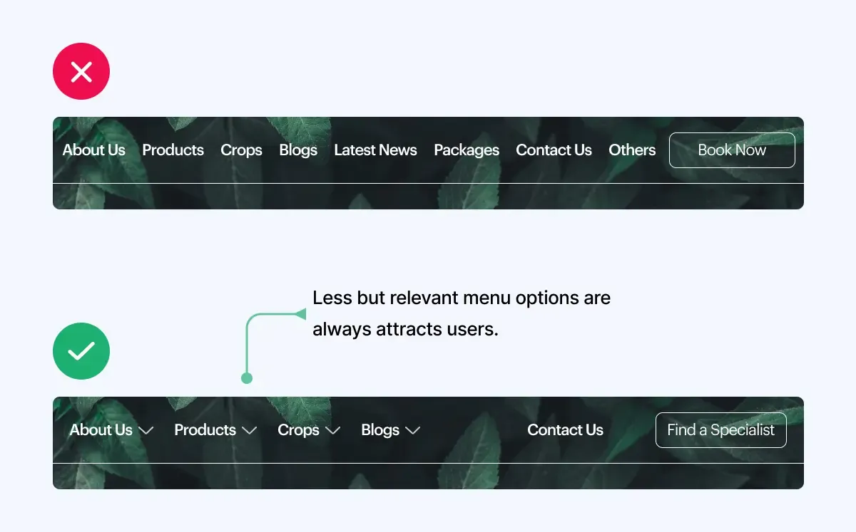
-Streamline Your Menu For Conversion Success
Keeping your menu streamlined and focused on the most important content make it easier for users to find what they’re looking for, improve their overall experience on your site, and potentially even boosts your conversion rates.
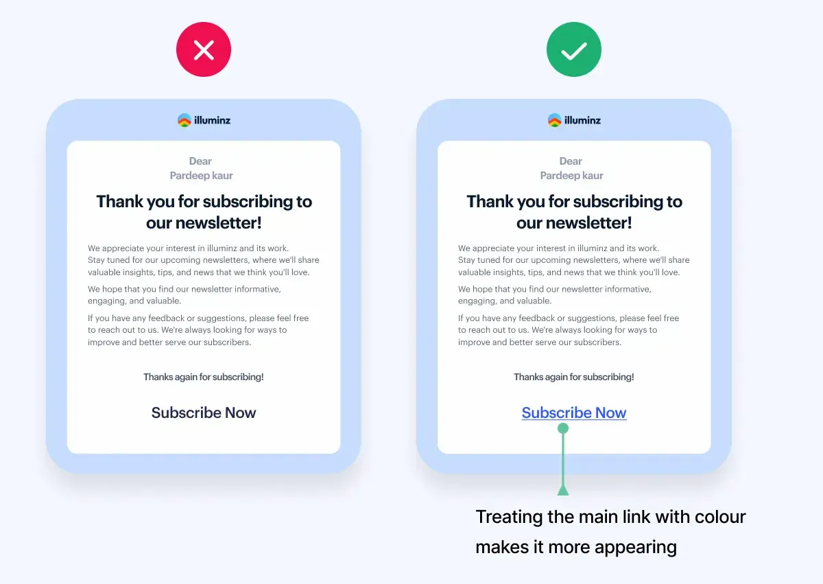
#5- Stand Out with Contrasting Colors: Link Visibility for Improved Website Navigation
When designing a website, using contrasting colors for different links is important. This helps the links stand out and catches the user's attention. By visually differentiating clickable elements from other content, users can quickly identify and interact with them. This improves the overall navigation experience and makes it easier for users to find what they want on the site.
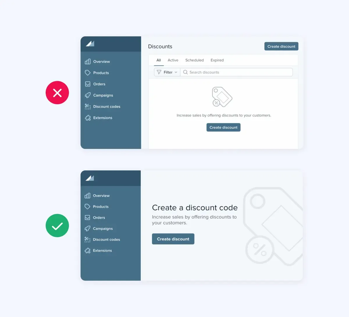
#6- Create a visual focus and quiet the noise for optimal results:
To achieve the best results, it is essential to minimise distractions. Each web page should have a clear purpose and a desired action for visitors. When you want to emphasise something, the key is to create a sense of calm around it.
One common mistake found is the attempt to make everything on the page stand out. However, this approach often leads to a cluttered and overwhelming user experience. Instead of making important content larger and more eye-catching, it is better to focus on making the rest of the page clean and discreet.
#7- Do make sure that all links are clickable:
-Keep Organized Categories
In today’s digital age, clickable links are crucial for effective communication and navigation. To improve clarity, ensure that your navigation menu has clearly defined categories, both in words and visually. Also, ensure that the sections, types, and subcategories are aligned and contain the correct links.
-Find And Fix Broken Links Quickly
Ensure all links in your navigation menu, including those in drop-down menus and subcategories, are clickable. Promptly fix any non-clickable or broken links that you come across.
#8- Do use the Magic of Mobile Optimization
In today's digital era, mobile optimisation is critical to website success. With smartphones becoming increasingly prevalent, it is essential to ensure your site is fully accessible and user-friendly on mobile devices.
Mobile optimisation enhances the user experience, facilitating seamless navigation and readable content. It also improves site performance, resulting in faster loading times.

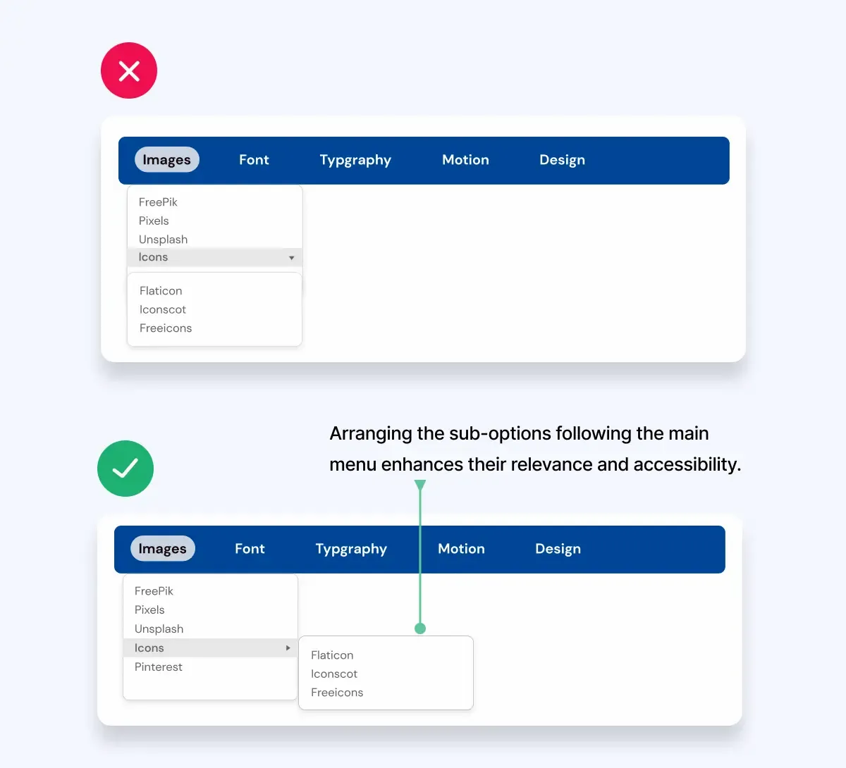
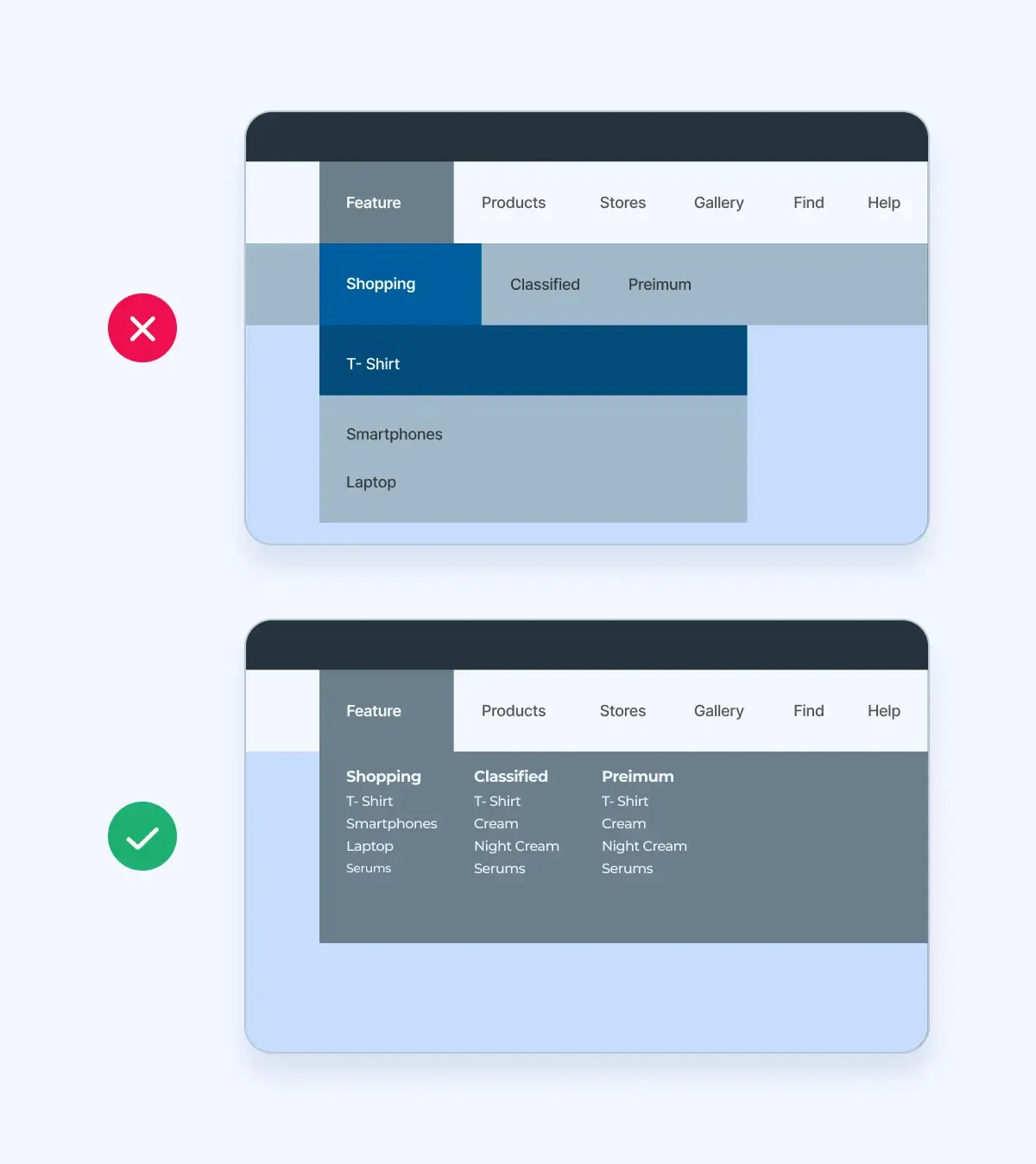
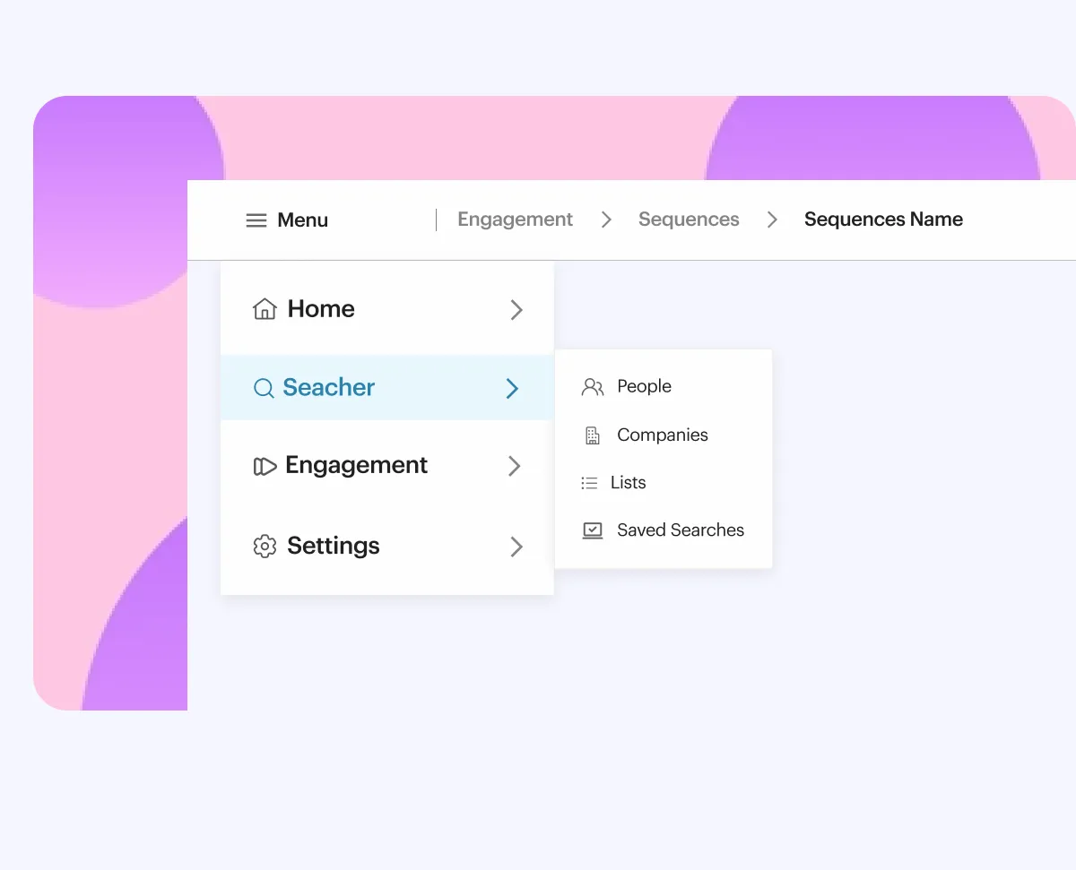
#9- Don't include too many categories in one drop-down menu:
-Use Fewer and Intuitive Menus
When designing a website or application, it’s important to remember the user’s convenience. One way to do this is by creating intuitive navigation menus. However, when it comes to drop-down menus, less can be more.
-Limit category options for enhanced usability
Limiting the number of categories within one drop-down menu can make it easier for users to find what they want. Nobody wants to scroll through an endless list of options. By keeping menus concise and organised, designers can enhance the user experience and make their platform more user-friendly.
So next time you design a drop-down menu, consider streamlining the categories and watch your user engagement soar!
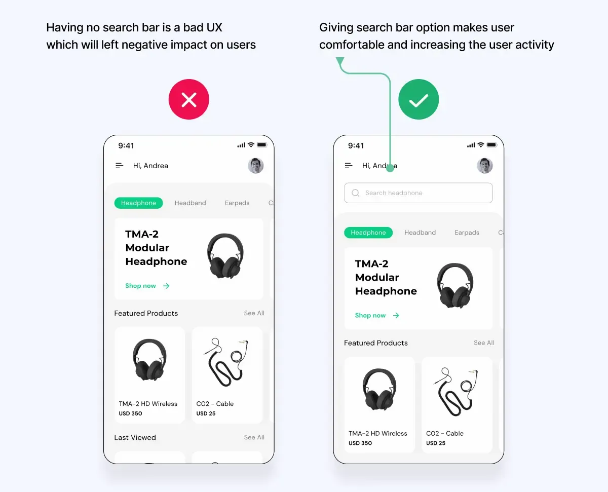
#10- Do allow users to search for content:
-Enhance User Experience With Efficient Content Searches
When creating a website or online platform, enabling users to search for content is essential. Visitors can quickly get frustrated and abandon your site without such a feature.
Not only does allowing content searches make navigation more manageable, but it can also enhance the user experience by allowing them to find the information they seek quickly.
-Improve Website Navigation With Search Functions
So, to keep visitors engaged and coming back for more, incorporate a search function into your website. With this simple addition, your platform becomes a go-to source for relevant and helpful information.
Example Websites with Outstanding Navigation Bars
Apple
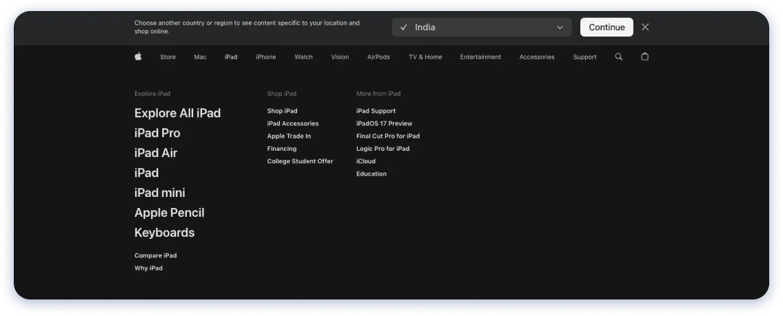
Apple's navigation bar provides easy access to essential features and is descriptive, guiding the users and enabling efficient navigation.
- Minimalistic design with easy access to essential features.
- Responsive layout for a user-friendly experience on different devices.
- Clear labels, intuitive icons, and strategic feature placement enhance the overall user experience.
Airbnb
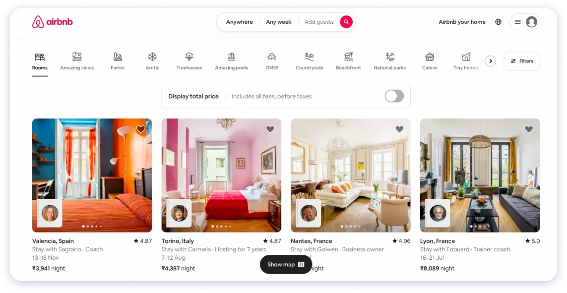
Airbnb employs a minimalist navigation approach, utilising concise, one-word category names to inform users about their services, facilitating seamless website navigation.
- The minimalist design promotes simplicity and clarity.
- The concise labels help users quickly understand the purpose of each category.
- The streamlined approach reduces cognitive load.
- The simplicity of the labels enhances the visual appeal.
- The navigation enables seamless exploration of different sections of the site.
Trello
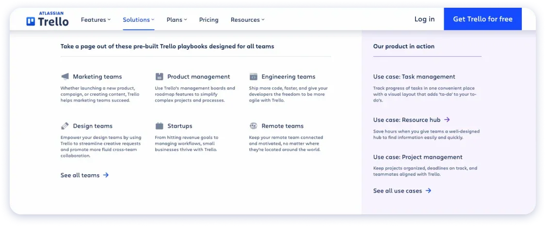
Trello's navigation bar is designed to be visually attractive and easy to use. It incorporates icons and labels representing various boards, notifications, and settings, allowing users to quickly access their tasks and project management tools.
- The icons serve as visual cues for different functions.
- Descriptive labels provide concise information about boards, notifications, and settings.
- Users can quickly access their tasks and project management tools.
- The navigation bar's layout ensures efficient task organisation and management.
- Consistency in design and placement promotes familiarity across devices.
By following these dos and don'ts of navigation design, you can create a seamless user experience that enhances website visibility, engagement, and conversions.
Prioritise clean and straightforward main navigation menus, descriptive and concise labels, a limited number of menu items, clickable links, concise drop-down menus, and a search function.
Website owners must pay attention to navigation design to avoid costly mistakes. Website navigation should improve customers’ overall experience and increase engagement rates and conversions if done correctly.
Frequently Asked Questions on Website Navigation Design:
Ques.1 What are the navigation design principles?
Ans. Website navigation design principles help create a user-friendly experience by maintaining consistency, providing clear cues, and offering guidance for seamless navigation.
Continuity: Ensure consistent navigation design across the website, including structure, style, and placement. Consistency aids user understanding and navigation.
Location: Indicate the user's current position in the navigation system—visual cues like highlighting or breadcrumb navigation help users orient themselves within the site's structure.
Indication: Use visual cues to highlight clickable navigation items. Icons, colors, underlining, and other cues differentiate interactive elements from static content.
Direction: Provide users with clear guidance through the navigation system. Visual cues like arrows, expandable menus, and progress indicators assist users in moving forward, backward, or exploring different website sections.
Ques.2 Why do some sites avoid a drop-down menu?
Ans. There could be several reasons why some websites avoid using drop-down menus. Here are a few reasons:
Prioritise a simplified user experience: Websites aim to make navigation easy and straightforward for users, and drop-down menus can sometimes be overwhelming, especially when they contain many options.
Mobile responsiveness: With the increasing use of mobile devices, websites must ensure their navigation works well on smaller screens. Drop-down menus may only sometimes be the best choice for mobile-friendly browsing, so alternative methods like hamburger menus or simplified menu structures are preferred.
Accessibility is also a key concern: Some users have disabilities that make navigating drop-down menus challenging. To create more inclusive websites, alternative navigation techniques that are easier for everyone are preferred.
Ques.3 How do UI designers decide when to put the navigation menu on the right (Twitter, Quora) vs the left (Google Reader, Facebook)?
Ans. In web design, the left side of a page is typically considered prime real estate, indicating its hierarchical significance. Facebook and Google prioritise navigation, placing it on the left, while Twitter and Quora emphasise content with left-side navigation.
However, a growing number of websites now position navigation on the right. As a designer, we personally prefer placing secondary navigation on the right for a few reasons.
Firstly, most people are right-handed, making it more convenient for cursor movement. Additionally, the right-side positioning aligns with the natural eye movement from left to right, making it an ideal location for the next action prompt.
Moreover, the scrollbar on the right allows for seamless alternation between scrolling and accessing the navigation menu.